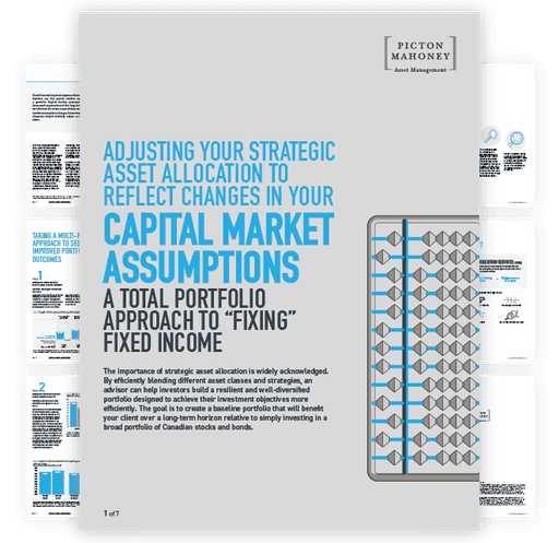
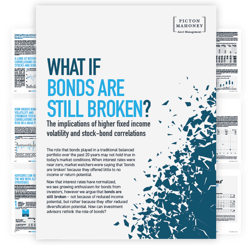
When I joined Picton Mahoney, their brand lacked a clear definition, consisting only of a loose colour palette and a single font type. No brand guide had ever been developed or even considered. Furthermore the visual expression of the brand did not accurately convey the brand's intended identity.
Build a visually consistent, robust, comprehensive, and well-documented brand that aligns with PMAM's unique business model, distinguished it from competitors, and created a memorable, recognizable presence.
I began by reviewing past marketing materials to understand the brand's organic evolution, ensuring the new brand would resonate with PMAM's existing clients. Guided by PMAM's alternative investment philosophy, I created a sophisticated, professional, and visually alternative brand identity. This new visual framework consisted of a diverse and colour palette, a new set of complementary serif and sans-serif fonts, defined spacial guides and layout grids and a modernist geometric graphical style with a recognizable dot matrix pattern coupled with primary shapes.
Primary
Secondary
Dot Matrix


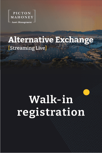
Picton Mahoney launched The Alternative Exchange (Alt.X), a new roadshow to showcase their investment philosophy, products, and insights to Canadian advisors. As their inaugural roadshow, Alt.X required design and development from the ground up.
Developed an on brand aesthetic for AltX that, using the brands new dark mode, distinguishes its marketing and communication materials from PMAM's standard materials.
Along with designing the event microsite, overseeing the design of event' promotional material, and personally creating the show decks I was given the honour of being the one to name the annual event, “Alt.X”.


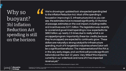
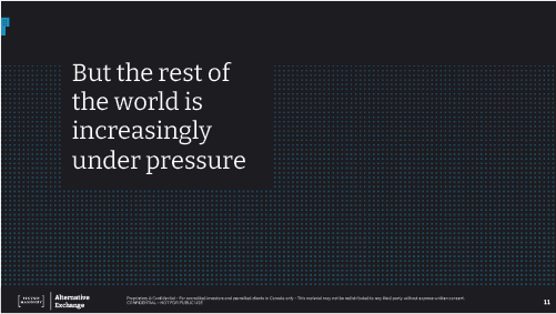

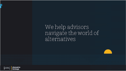
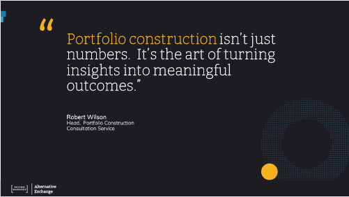
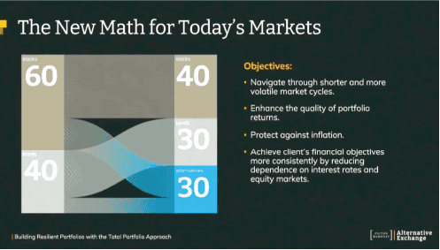
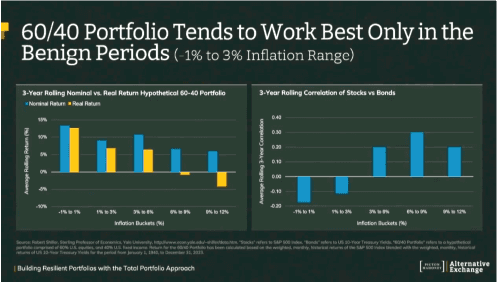
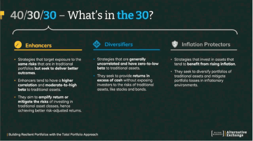

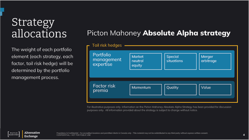

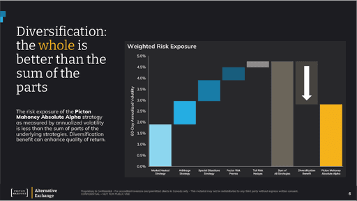
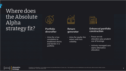
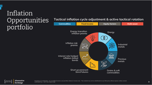
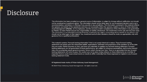
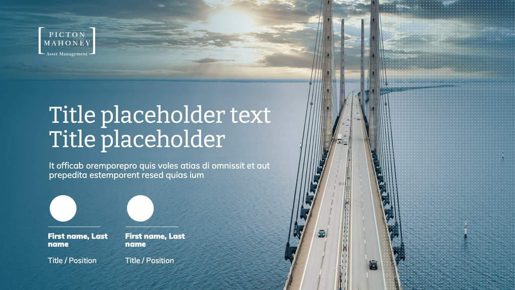
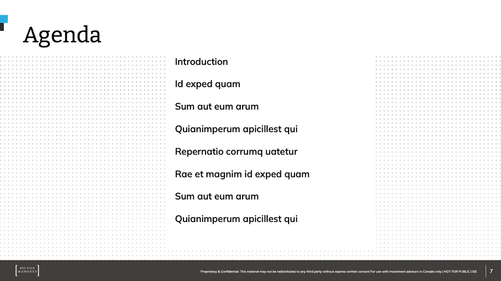
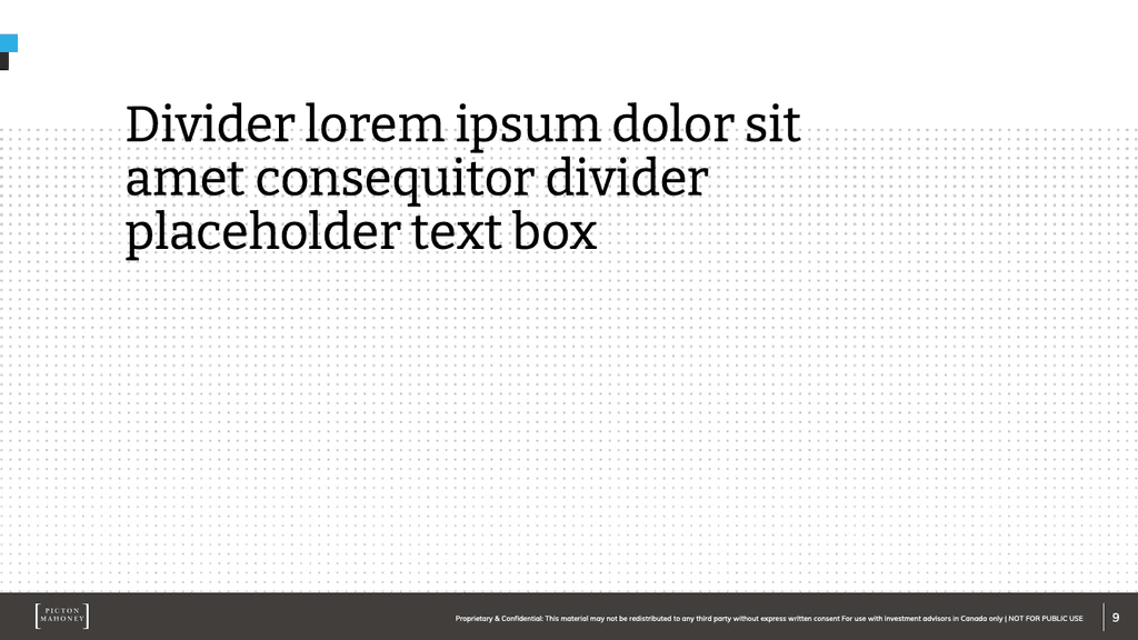
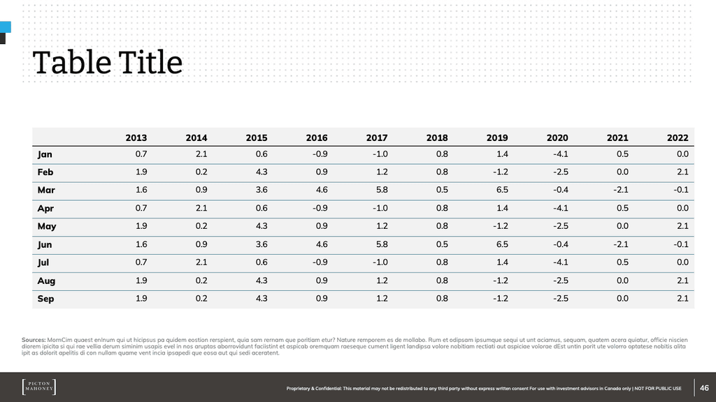
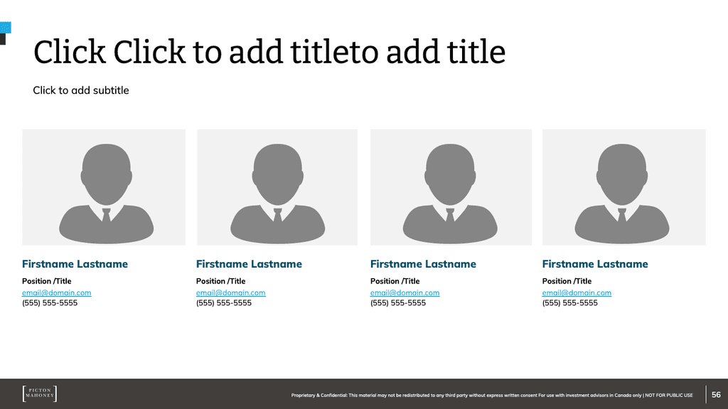
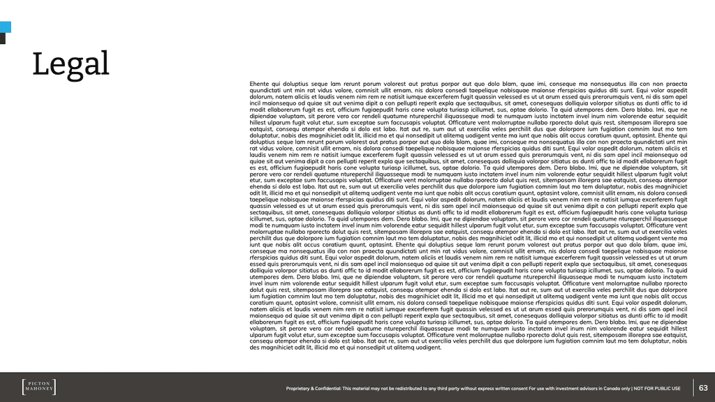
A recent re-brand rendered the existing PowerPoint template outdated. The template's limited slide options also resulted in inconsistent, off-brand presentations.
Leading the design effort, I created a cohesive and comprehensive PowerPoint template with over 60 well-designed, brand-aligned slide options (available in both light & dark modes). This project, addressing PMAM's diverse presentation needs, also served as the inaugural showcase of the company's new brand identity.
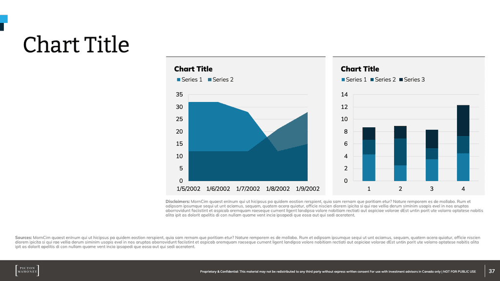
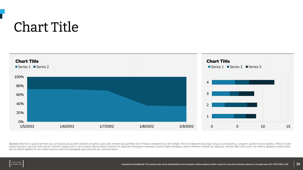
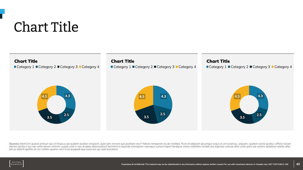
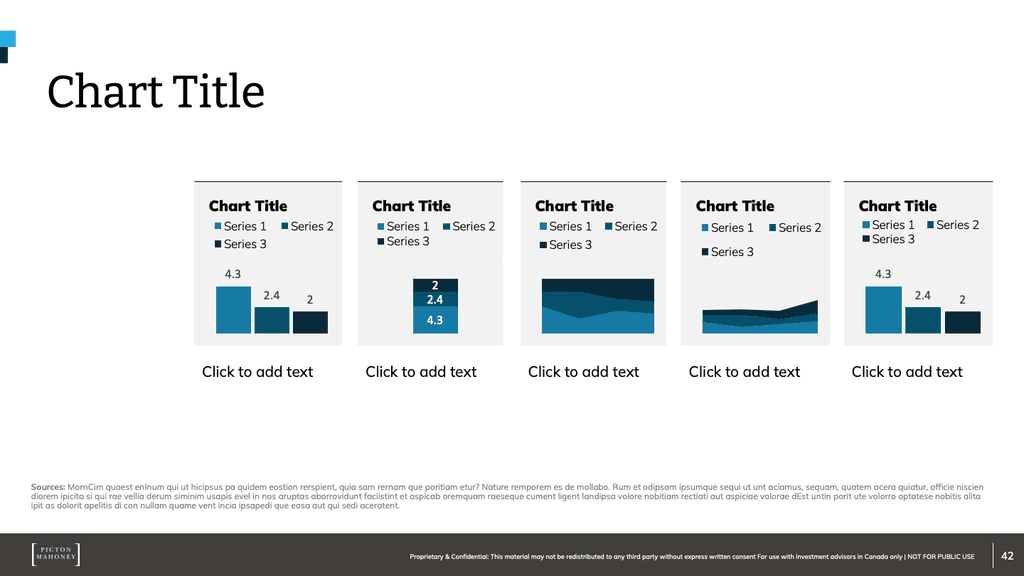
In addition to the template, I also created a user guide outlining basic design principles and slide options, as well as a chart template pack for single click brand compliant chart formatting across all Microsoft Office applications.

























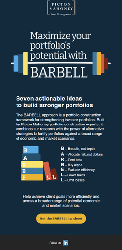
To help advisors build stronger, more resilient investor portfolios, PMAM developed seven actionable strategies they called the “BARBELL approach”. Marketing and sales teams needed a campaign to be designed showcasing each of the BARBELL strategies.
Create a campaign where each letter of the strategy name was a bar weight. When combined on a bar they created the hero image for the campaign. This bar-bell weight concept was used to create a campaign landing page, supporting articles and an email marketing campaign.




No real "problem-solution" here, other than the need to create branded well designed images and videos for LinkedIn posts.



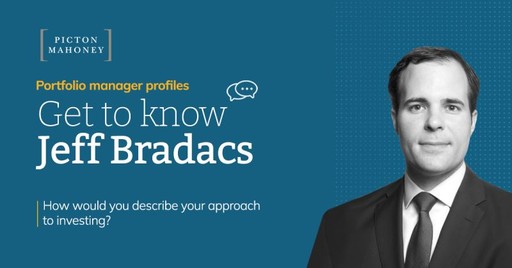
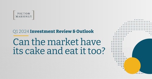

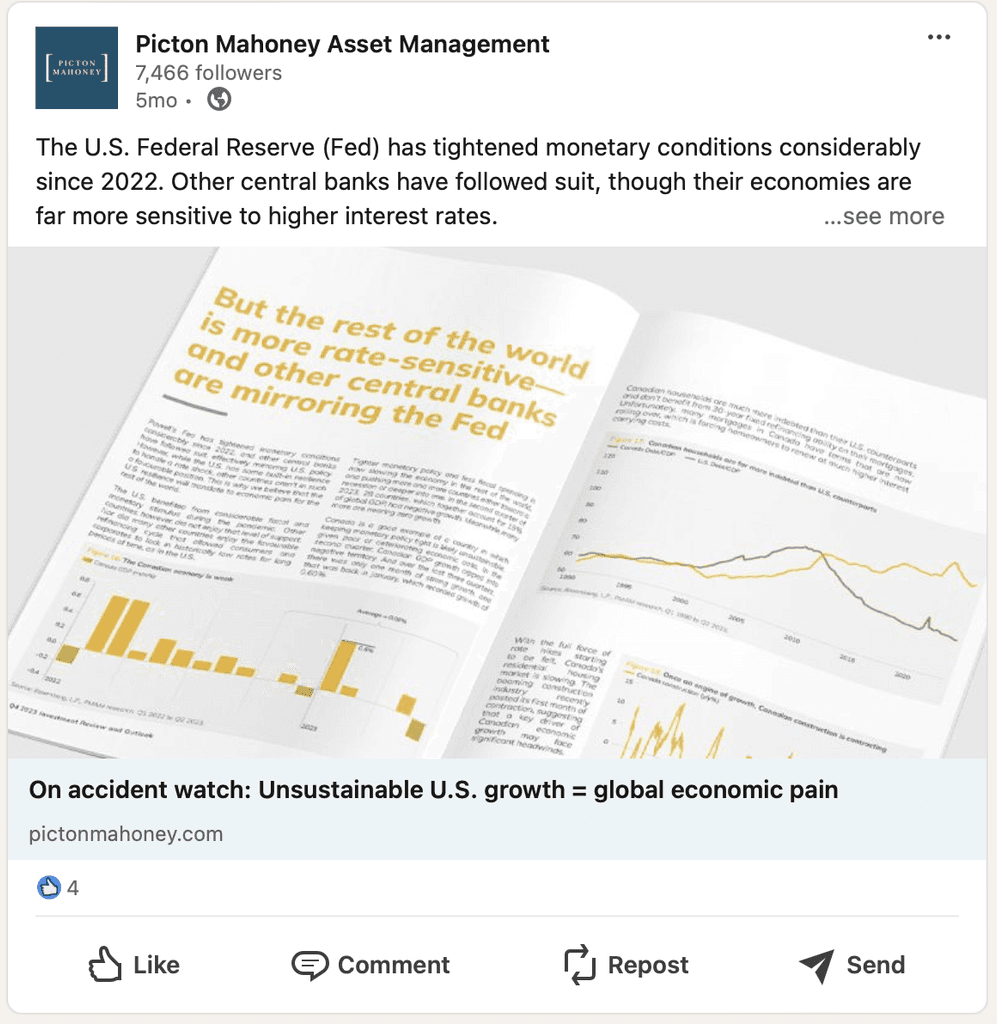
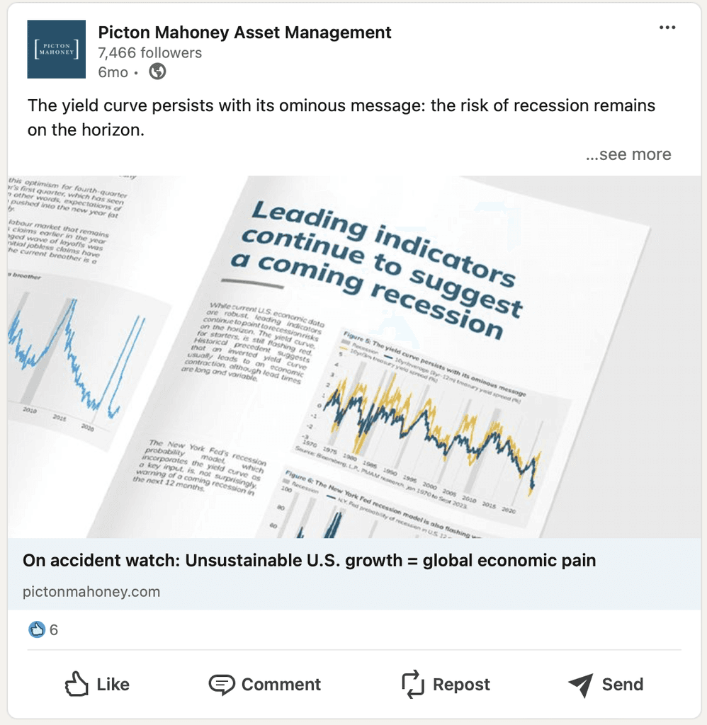




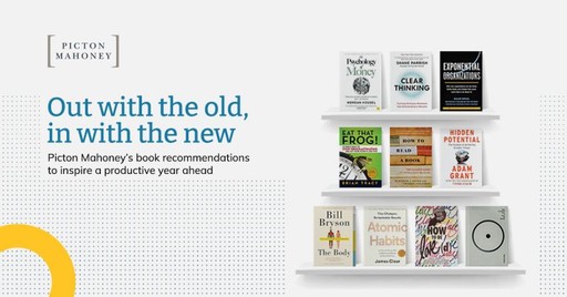
Various articles showcasing layout design and cohesive application of PMAM's, new and old, brand.